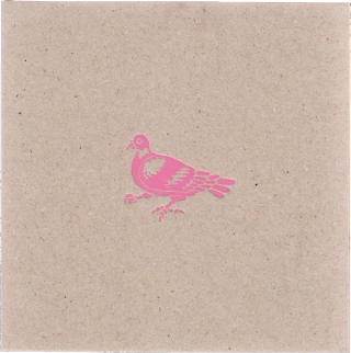
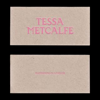
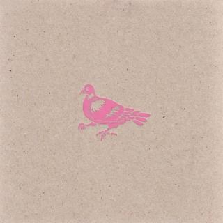
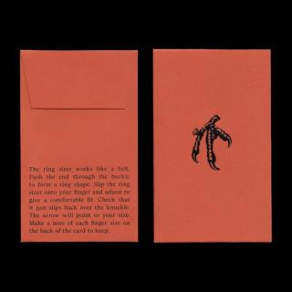

References for the brand identity included renaissance wood-cut typography, heraldic symbols, London architecture, Victorian supernatural paraphernalia and of course the humble pigeon. We worked with Hannah Montague on a bespoke typographic logo and Justyna Kabala on a heraldic pigeon marque and claw illustration for use on the packaging. The packaging combines lo-fi, tactile materials with high-end finishes and processes. Recycled board boxes have been precisely assembled giving crisp edges and corners combined with a bubblegum pink foil block.
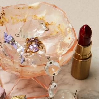
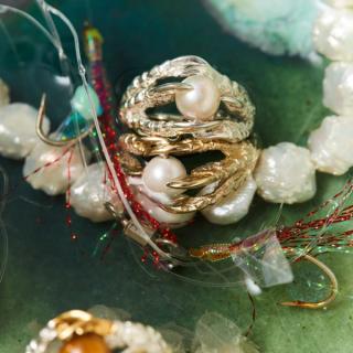
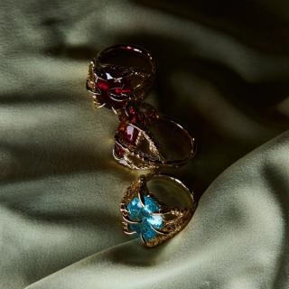
The project included a full re-design and build of Tessa's e-commerce platform. A pared-back, intuitive user interface placing the rings and jewellery centre stage. Tessa wanted the site to feel 'somewhere between a shop and a gallery'. New product photography by Amy Gwatkin feels raw and authentic and moves away from the sterile cut-outs commonly in jewellery e-commerce.
- Client
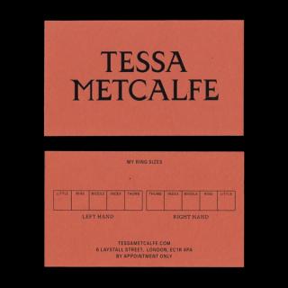
Tessa Metcalfe
- Creative Direction
10PM
- Logotype Design
Hannah Montague
- Illustration
Justyna Kabala
- Photography
Amy Gwatkin