Rep is an agency working across fashion, editorial and advertising bringing together an international roster of photographers and stylists at the forefront of image-making.


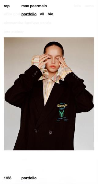
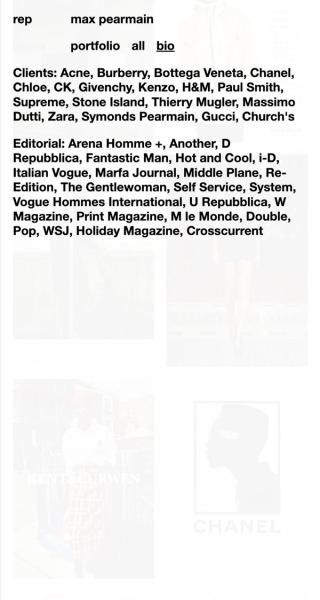


Working with the brand’s existing pared-back visual identity we created an equally minimal interface based around a single font, weight and type size. The concept for the site was inspired by a look-book from the 1980’s printed on very thin paper which allowed images to bleed through into the page above. Pages on the site layer up as the viewer navigates leaving subtle traces beneath.
Art Direction: Rory Gleeson Digital Design and Development: 10PM